Sunday 30 September 2012

NME

Target audience: Indie/ rock music audience.
Price/frequency: £2.40/ weekly.
Number of pictures: 8 pictures.
Analysis: Main picture for the main article in the centre. Rest of the pictures are round the main picture, all with little captions and the page number big and bold in the corner of the picture. 
Picture captions/labels: Quotes said who the article is about and there reply is quite humorous.
Language used: Jokey/ sarcastic style in the writing.
Number of pages in the magazine/number of articles mentions: 66 pages and 16 articles.
Use of colour: Black and white very basic. Pictures are quite dull and dark, focused on the rock side of the magazine.
Use of font: Bold title, all text is black. Style of font varies in every, bold regular, italic. and the size also varies.

Marie Claire

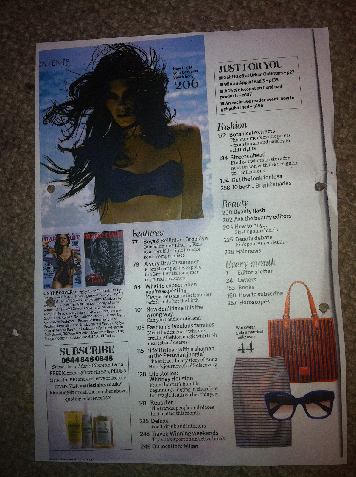
Target audience: Womens magazine, from about 20's-30's.
Price/frequency: £3.70/ monthly.
Number of pictures: 8 pictures.
Analysis:Bright, fairly large. Pictures are scattered around the pages, but are quite bright and girly. Pictures are like a little sneak peak of what article is about.
Picture captions/labels: Leaves you wanting to read the article Sort of like a cliff hanger. This makes the reader want to read on the articles they are interested in.
Language used: Alot of quotes used. Girly words used throughout to make articles appeal to them.
Number of pages in the magazine/number of articles mentions: 257 pages and 44 articles.
Use of colour: Black and white text and background. Pictures very bright to grab readers attention.
Use of font: Bold title. Subheading slightly, smaller than heading and italic. The rest is same dont size.
Any other information: Pictures are all of women. This shows who the audience is aimed at.


(The back of Marie Claire)


OK

Target audience: 
Price/frequency:
Number of pictures:
Analysis:
Picture captions/labels:
Language used:
Number of pages in the magazine/number of articles mentions:
Use of colour:
Use of font:
Any other information:

Scratch

Target audience:
Price/frequency:
Number of pictures:
Analysis:
Picture captions/labels:
Language used:
Number of pages in the magazine/number of articles mentions:
Use of colour:
Use of font:
Any other information:

What is found in a school magazine and the purposes of the school magazine.

Whats found in a school magazine?

  • Recent news about school.
  • Pictures.
  • Recent event: sports day, arts evening, concerts etc.
  • In-school competitions.
  • Students work.
  • Students and staff included, featured and writing.
  • Up coming events.
Purpose:

  • Benefits students.
  • Extra-curricular.
  • Inform parents/ students/ teachers.
  • Communication.
  • Gives students a voice.
  • Brings students and staff together.
  • Allow students to show their talents off.

Contents page

Contents Page

What are the conventions of a contents page?

  • Article titles.
  • What will be in the magazine.
  • Page numbers.
  • Pictures related to whats inside the magazine, pictures vary in types and sizes.
  • Summary/ a few lines.
  • Captions on pictures.
  • Quotes,
  • Editors letter (sometimes).
  • Title saying contents page.
  • Beginning/ front of the magazine.
  • Easy to navigate- page order, themes, regulars, features.

Analysing Ruislip Eye


Ruislip High School magazine- Ruislip Eye

Technical Codes:

Layout of the page- Neat and organised, every picture is boxed off to represent the organisation of the school. Two large pictures, they are large because it draws the attention to artilcle to attract the readers eye to picture of the centre of the page, so that they are then attracted to the main article.
Typeface/font- Heading is bold and white to against blue backgroungto grab readers attention. Black text is normal case and makes heading stand out more because it is a different colour and size.
Size/quality of photos- Two large photos in centre of the page. Clear and insight. Automatically readers eyes are drawn to page. Picture arent too busy and makes it clearer to see whats going on.
Cropping of photographs- Cropped to show close up of picture to show a close up of the 'trash outfits' and gives the reader more of an idea what the article is going to be about. Also its an interesting different mixture of trash being made into fasion. The little picture on the side of Santa Claus and his elf to shows the theme of christmas.
How photos relate to stories- They have made items of clother through trsh and the article is called 'Trashion'. Shows the mixture of trash used. Also the little picture on the side of Santa Claus and his elf to shows the theme of christmas.
Why  pictures have been used- Picture have been used to liven up the magazine, rather than it just being purely based on just text, as it is a magazine for teenagers, they wont to influence more reading but not too boring, so pictures are the added. It splits it up abit.

Written Codes: 

Size of cover lines- The vary but headings and subheadings are slighting bigger then the rest of the test, because it shows the importance of the titles, and article titles. Readers then looks at the titles after the looking at all the pictures.
Key Words- Ruislip Eye, trashion, Ruislip High School- telling audience about the main article and school name.
Missing information/ fulfilling expectations- Trashion kind of a cliff hanger, as you dont know quite what they ment. But then looking at the picture sort of resolves what exactly they are talking about. 
Persuasive language used- Ruislip 'eye' This represents that Ruislip Eye magazine, is like the eye of the school, It knows everything about everyone, and what exactly is going on. This attracts all the people of Ruislip High to the newest 'gossip' of the school.

Symbolic Codes:

Colours- All shades of blue, then black and white. This ties into the school colours, and shows them representing the school, sharing all its important and proud moments. Representing and showing the proudness of the school.
Symbols- A christmas holly in the corner of the page, to represent the theme of the magazine, christmas. Also a icon of a cartoon school boy in uniform.


Analysation of HELLO! magazine

Technical Code-
Layout of the page: Main picture stands out and is in the centre of the page to show the importance of the main article. The second picture of on the top right hand corner of Prince Harry, shows the high status' of the royal family. As it is the second biggest picture of the magazine. The magazine knows that they will be the main interest of the magazine. Also shows the class of the magazine, no real like stories purely based on the royal family.
Typeface/Font: Bold white font through out the magazine, But size varies depending on the importance of the articles and audiences interest. All upper case to show the importance of the stories.
Size/quality of the photographs: 3 are professionally done. The other one of Prince Harry is a more action picture taking by paparazzi  This relates to 'The wild Vegas weekend' a picture that was actually taken whilst on holiday to show what hes really been getting up to.
Cropping of the photographs: None of the pictures are cropped. 
How are the pictures related to stories: New born baby, so there is a family picture with their baby. Sarah Harding has a 'new beginning', she is dressed all in white and a white bright background,this sure the pureness of the new beginning themes of the magazine. 
Why pictures have been used: To show what the article is based on. Attracts reader to buy magazine, if they see a picture of a celebrity they are a fan of.

Written codes-
Size of cover lines: All capitals to show the importance of the royal family.
Key words: Hello, exclusive, Kate, Prince Harry, royal report, court.
Missing information/fulfilling expectations: Royal report, this lets the reader think that something to do with the media, police, or anything that has been recorded down, that something has happened. This makes the reader want to read the article. 
Persuasive language used: Royal report-Because its all about the royal family and they are always in the public eye and public's interest. 

Symbolic Code-
Masthead/name of magazine: HELLO!-hello to show a welcoming of something new, so you can find out new information. The exclamation mark shows the importance and urgency of the articles. Red back ground in rectangle with the white bold upper case 'HELLO!' The read also shows the urgency, but can also represent things like love, anger, importance, covers everything in the article. White writing stands out.
Colours: White, red, black, white- fresh now information. Red- shows it is urgent to read.


Sunday 23 September 2012

Analyzing Closer magazine

This is some work I done in class, looking at magazine covers and analyzing them. Describing why they have chosen certain colours, why they have choose a certain picture, and what does it represent.

Signs and Signifiers

Different collours are used in a way to communicate different kinds of moods and messages.
E.g.
Blue:
  • Signifies a calm feeling.
  • It can also signify sadness and depression.
  • But can linked to nature, by the sky and sea.
  • It shows the science and technology side.
Black:
  • Black can signify dark and scary settings, things that are spooky, and give it a edgy look.
  • It can also be mysterious as not knowing what is lurking in the dark colour.
  • Represents death and sadness.
  • It can be a serious and sophisticated colour.
Red:
  • Red signifies love and can be used on programmes and magazines as roses and red love hearts. 
  • Red also signifies danger.
  • It is like a warning as it is so bright and outstanding.
  • A sign of fear.
  • A sign of anger.
White:
  • White signifies a heavenly and peaceful approach to media.
  • It can also be shown as bright and clean.
  • Spiritual and purity.
These are the sheets I done in class following on with this signs and signifiers task.